Writer How To: my writer website part ii

Dear Internet,
On Sunday I talked about what authors should (and shouldn’t) have on their websites, yesterday I broke down the branding, design, and infrastructure of my own author website, and today I am going to discuss main navigation and why I set it up this way, child pages, what’s left to do on my author site, and base plugins you should use for your own WordPress site.
Here is the landing page of my author site again:
lisarabeycomlandingpage
Let’s take a look at the main navigation, homebiofictionother writingblog, and contact. Each of these links are to the minimum pages an author should have as I mentioned on Sunday.
Home will bring you back to the main page.
ProTip: If you include an image header on your page, make it a clickable link back to your main page. This way if people get lost in your site, they have an easy way to get back to the beginning.
Bio will contain the short and extended about me along with a headshot of some kind. 
Fiction will contain all the fiction work (short stories, novels, novellas, etc) with links to purchase or to read.
Other writing will link to mainly non-fiction and academic works. 
Blog will take you directly to EPbaB.
Contact will take you to a contact form.
ProTip: I’ve heard both sides of the story on whether or not to keep a contact form. One argument is that it creates a barrier with your readers, can get confusing, and you’re not entirely sure if the form was sent or not. My personal experience, having managed websites other than my own with contact forms, is you’re more apt to get people writing in using the form rather than if you provide a simple email link. I will more than likely include an email link on the form itself to give people the option.
ProTip 2: Interestingly, the sites I looked at for Sunday’s piece had a lot of the writer’s putting their reps as the contacts but no way to directly contact the writers themselves. “For foreign rights, email joeschmoe@you.com. For media inquiries email yourmom@thejeez.com.” I thought that was interesting.
Let’s take a look at one of the child pages.
childpage copy
I’ve clicked on other writing. We know the link we’ve clicked on takes us to the right page by a few clues. The first clue is the word other writing in the navigation bar is now white instead of grey. Second clue is the breadcrumb shows us where we are, and thirdly, we have a header that tells us on what page we’re on.
As far as design goes, all the child pages will look identical to this one. We have our main navigation at the top so we can bounce around. Our header image from the landing page has been resized to fit comfortably and allow content without (much) scrolling. The right hand sidebar has the same content as the landing page sidebar. The main content box is easy to read and links are easy to find. Header text  is obvious and tells us what the page will contain. Lastly, we have a sharing bar that allows us to share the content across various social networks.
ProTip: I debated on having a share option on these pages since they will remain mostly static, but thought it might be useful if I write a trillion short stories and someone wants a printable version or share it with their BFFs across the social sphere. This is another plugin within Jetpack that allows you to cherry pick social networks you can share across. Plus I get annoyed when I find a page that does not have sharing enabled, so better turned on then turned off.
Now that we’ve got the main infrastructure in place and a design we like, let’s sum it up:

  • We have (potentially) cohesive design that works with my other sites
  • Each site is clearly identifiable of what it is and links to its brethren
  • The design and structure are responsive and mobilized
  • The layout and navigation clear and easy to use
  • Pages are well marked
  • Typography is pleasing easy on the eyes, link colors are bold

Over the course of a week I’ve put about five to six hours of work in with a couple more hours left to go. Since most of the work was design and infrastructure, the least bit is content which should take less time but in my case, I’m importing all the writing works over from EPbaB to the author site for consistency, so that’s taking a bit longer.
What’s left for me to do:

  • Fill out content of child pages
  • Flesh out widgets in right hand sidebar
  • Check for grammar and spelling errors as well as verb consistency
  • Tweak accessibility
  • Export over to live site

Now that we’ve got the site in place, content sorted, let’s talk about the base plugins we can use to make the site even better.

  • Jetpack for WordPress has over 30 plugins in one beautiful package. I use the following: contact form, custom CSS, enhanced distribution, extra sidebar widgets, JSON API, mobile theme, monitor, notifications, omnisearch, publicize, sharing, shortcode embeds, site verification, spelling and grammar, subscriptions, wp.me shortlinks, widget visibility, and wordpress.com stats. A lot of these plugins have variations available individually on WordPress’s site, but I like knowing that Jetpack is constantly updated, added to, and guaranteed to work with the latest versions of WordPress itself.
  • All In One SEO Pack Search Engine Optimization is how web crawlers find you, index you, and then report back when people are searching for you. While the metrics and math can get complex, you can significantly increase your traffic by following a few simple SEO rules. This plugin does the work for you. Here is why you should use it: a few months ago I was wondering what other writer’s sites looked like, so I did some basic keyword searching and found — nothing. Well, almost nothing. Today while thinking about the same search, I wondered if there would be a difference if I swapped out the term “writer” for “author” and the answer turned out be a surprising fuck yes. I also duplicated near same results in Bing.
    This tells me a lot. One, it tells me how Google (and Bing) are indexing content. Two, it tells me even if a writer type person doesn’t use the word “author” anywhere on their website, or metadata, to be indexed, Google and Bing still sort them out as “authors” and list them under that search term  but not under “writer.” The search engine derivatives of “writer” seemingly refer to magazines, goods, and services. So if you prefer the term writer to author, this could hurt you in terms of SEO. Now most people interchange author/writer, but there is apparently a difference with the gist referring to a writer as someone who technically writes whatever (just as a baker bakes) while an author is someone who comes up with the ideas and plans to execute the writing. Someone can apparently be both. Another argument is a writer is someone who is unpaid while an author is a paid professional.
    Whatever you believe or agree with, the bottom line is if you want to make sure you’re getting properly indexed, you need to use SEO to make sure all of your bases are covered so use author/writer in your SEO markup even if you use only one term in your content.
  • Breadcrumb NavXT The easiest and most complete way to set up breadcrumbs on your site.
  • Broken Link Checker Nothing more annoying than going to a site, clicking on a link and discovering it was dead. This plugin actively scans your links (internal and external) and reports back which links are broken and with what kind of errors. Super handy to use and makes your site look a million times more profesh since you can clean up errors and change links from across the site in a single page .
  • Google XML Sitemaps One way to make your site easily indexed by any search engine, on top of SEO, is by having a XML sitemap on the ready. This plugin generates a new XML sitemap based upon your specifications, which can get pretty in-depth. It automatically notifies Google and Bing of any updates.
  • Analytics How are people finding you? How many page views are you getting a day? How many visitors have you had? Jetpack comes bundled with its own analytics, but you may want to use another one or two more as not all analytics software are created equal. I use Google Analytics (which is part of Google Webmaster Tools) and StatCounter.

This has been a quick and dirty walk through on getting a simple author website up and running that is not only informative but eye catching as well. There is a lot more (isn’t there always?), but this should give you a good understanding of why things are done a certain way and access to tools that can accomplish your goals.
Cheers!
xoxo,
Lisa

This Day in Lisa-Universe:  2010
Writer How To: my writer website part i

Dear Internet,
It seemed only fair after I doled out all that advice yesterday, I should show you the money. I’m going to throw down my author’s website, software and apps I use, as well as design thoughts and more.
As I mentioned yesterday, TheHusband suggested I keep my author site separate from Exit, Pursued by a Bear (where you’re located at now) and my librarian site. I agreed. However, since I am going to have three sites to maintain, they all need to be consistent and relate to each other in some fashion.
A couple of years ago, I designed business cards using the image of three year old me holding a phone as the main graphic, which was also the main header image at EPbaB for a long time. The cards were a huge success when I handed them out and people easily remembered who I was later on. Since it was time to make new cards, I expanded on that idea and decided to use the same concept across my sites.
(If you click on the images, it will open up a new tab with a larger image for greater detail.)
Exit, Pursued by a Bear – Online Journal (Theme: Mon Cahier child)
EPbaBlanding
Cunning Tales From A Systems Librarian – Librarian Site (Theme: Elucidate)
profeshlibrariansite
Lisa Rabey – Writer (Theme: Arcade Basic)
lisarabeycomlandingpage
The only site I’m not 100% happy with is my librarian site, which I will futz more with later. There are also couple of other things I can do to make all three sites more cohesive, but the idea is there and I like where this is going. The Lisa Rabey Empire is coming to fruition!
Now that I know how I’m branding the author site, I played with the freely available themes at WordPress until I found one that would work for my needs and required as little hacking as possible.
ProTip: I exported a  year’s worth of entries from EPbaB and imported them into the test site to see how the theme handled a wide variety of posts and formating.
I looked for a theme that allowed: Custom header, adding breadcrumbs easily, two column so I could have a sidebar, and top navigation bar that wouldn’t get lost when you scrolled. I like white backgrounds with no textures, and I wanted something that was eye popping. It also had to work mobilized via the Jetpack for WordPress plugin. I settled on Arcade Basic.
ProTip: As someone who likes things quick and to the point, Jetpack for WordPress is one of the best plugins you could install and make your life insanely easy. I know a lot of my more advanced WordPress/coding friends are not a fan of this plugin for a variety of reasons, but as someone who wants no fuss, no muss and ease to use? This thing is a godsend.
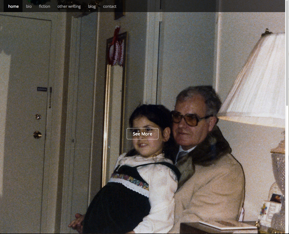
When you land at my author’s site, you see a young Lisa with her pops as the landing graphic. There is a top navigation bar for home, bio, fiction, other writing, blog, and contact. Here is all the basic information I mentioned yesterday clearly listed and easy to find.
In the middle of the landing page is a box that says See More. When you click on it, it jumps down to the second half of the landing page where there is additional content (there is also a scroll bar in the right hand side if you want to use that instead).
ProTip: I’m not crazy about the wording of “see more” so I may just change it to something else, which will be easy enough.
lisarabeylandingpage2
Excuse my rudimentary Photoshop.
The navigation bar stayed in place when we hopped down the page, which is why even though I know a lot of people hate these giant graphic landing pages, I loved this one because you don’t lose your navigation.
The main content box is a quick about me / this site. There is also a search box, social media links, and a news feed.
ProTip: Having learned my lesson trying to maintain blogs across variety of sites, I found a work around that allows me to keep this site looking like it’s constantly updated without stress by using the Appearance->Widgets->RSS widget within WordPress. Every category and tag in WordPress has its own RSS feed, so I can pull a specific feeds to show up in this particular widget box. There is no limit to the number of RSS widgets you can use. For the news widget, I mark all my writing stuff under the “writing” category  on EPbaB and the feed is pushed on the author site. I do the same thing on the my librarian site, under recent posts in the sidebar, which has its own category for the very same reason.
To recap: I write everything on EPbaB and the RSS feed for a specific category are fed to specific sites based on feed name. If people are interested in the whole shebang of the blog, they can click on blog in the top navigation.
I wanted two columns because I need the ability to add/remove things as necessary for whatever reason without losing the main content box or forcing people to scroll to the bottom. When I get a newsletter up and running, books to buy, or whatever, it will go in the right hand side bar. Additionally, Jetpack has a feature that allows you to show certain widgets on certain types of pages for more customization.
Tomorrow we’re going to look at the main navigation and why I set it up this way, child pages, what’s left to do on my author site, and base plugins you should use for your WordPress site.
xoxo,
Lisa
P.S. As my author site is not live quite yet, but I do link to it, so if you find a broken link, that’s why.

This day in Lisa-Universe:

Conference Summary: MLA Applied Technologies & Trends Workshop

On Friday, May 10, I had the pleasure of presenting at MLA Applied Technologies & Trends Workshop, If you caught my show before, at Library Tech Conference, you may notice some similarities. The presentation I gave at MLA is updated with a lot more content  and recent revisions as well as I even have a checklist put together that I PDFed for people to use that I promised to have for people back in March.
Since I was one of the last persons to present, below are my notes on the other presentations I attended along with links as appropriate.

Keynote: Good For Whom? 

By Matthew Reidsma / Grand Valley State University
Why are decisions made for design not carried over to digital tools? Meaning, why do we apply strict questions to physical items but not to digital ones.

  • Functional: How does it function?
  • Behavioral: How do behaviors change?
  • How to do it?
    • This is where most people stop.
    • These are internal questions, that we ask ourselves on everything.
  • “The library world has been fa too gullible, far too willing to regard any technical advance as a service advance.”  – Jonathan D. Lauer & Steve McKinzie
  • Human: How does this affect human experience?
    • Need to think more about the person who comes into our library, less about what we’re doing about them.
    • How do people FEEL?
      • How you treat people is more apt than what you did or will do. For example, if you treat a customer nicely, they will tell maybe 1 or 2 people. If you treat them badly, they will tell, on the average, nine people about their experience.
  • “User experience isn’t about expert intuition, it’s about expert listening.” – Whitney Hess
  • External questions: How to find how these technologies  are going to affect not just people, but work flows, and technologies themselves.
    • Adding the human element
  • A way forward: Ditching the label maker
    • Prioritize users over process
    • We could be reactionary (train industry of people to undo the work of crappy vendors) or say to the vendors, “Makes this easy to use.”  Demand it to be easy to use.
  • Prioritize users over processes

Resources/sites mentioned

Session: Cloud & Mobile Computing 4 Your LIbrary Resources & Services

By Michael Samson / Wayne State University

  • All the Google products, all the time
  • Chromebox / Chromebook instead of using vendor specific hardware
  • Hardware: Android (Nexus 4, 7, 10)
  • Tools / apps / gadgets
    • Creating custom search engine for faculty for their interests
    • Ability to share content via Google drive (presentations, documents)
    • Cloud is the new mainframe
  • Creating an entire workflow of tools in the Google cloud

Session: Sharing Technology Skills with Patrons and Colleagues

By Scott Skowronek / Lansing Community College

  • Uneven distribution of technology skills across staff and faculty
  • Creation of Tech Guides
    • 4 student staff per semester
    • Empowered to seek out and assist
    • Customer service focused
    • Roving support
    • Employee traits & Responsibilities
      • Keep the interactions time short (15 minutes) and then escalate
      • Know the GRCC core systems
      • Record each interaction (to identify peak times and keeps statics)
    • Training
      • Identify the “Big 3” technical problems and train the guides on these first. Example:
        • Blackboard problems
        • Forgotten passwords
        • Attaching files to emails
      • Find the technology pain points
        • Ex: Printer jams
      • Work with staff strengths
      • Collaborative training
        • Using iPads with Google docs to  train and track problems, seamless synching and updating
      • Encourage guides to Google for problems
    • Logistics
      • One tech guide on shift at a time
      • 3 hour shifts
      • Tech guide iPad
      • Peak hours
    • Pitfalls
      • Morale issues
      • Patron problems and problem patrons
      • Shift switching and absences
      • Staff technology ability
  • TechSnippets
    • Presentations that contain 10-15 minutes of content, open to faculty/staff
    • Maybe schedule 15 minutes  for discussion after
    • Schedule midday – more people on campus, this is when departments break for lunch, etc
    • Discuss single technology or a cluster of similar
      • Dropbox (Google Drive, iCloud)
    • Discuss singular concepts
    • Feed them!
      • Get a $100 convention oven, make cookies!
      • Use cookies to lure them into your lair
    • Marketing
      • Multiple channels
      • Multiple reminders
      • LibCal for sign-up and contact
      • Target a specific audience
  • Resources for ideas for Tech Snippets

Session: What to put on that new TV in the lobby

By David Hytien & Britain Woodman / University of Michigan

  • Content
    • Creative Commons content
      • Youtube. Vimeo, etc
      • From NASA, NOOA, White House, Internet Archive, Flickr
    • Content from various places like the above, plus student content, staff content, and public content available on campus, found content
    • RSS feeds
  • Logo
    • Recommend size is 1080×1920
    • Transparent
    • Should be png or gif as they are lossless
  • Videos
    • Create in iMovie, drop movies and logo just created
  • Resources